Gaveto.otf
Year
2019
Services
Typography
Awards
Featured on Behance • Typography Gallery
International recognition awarded to curated projects
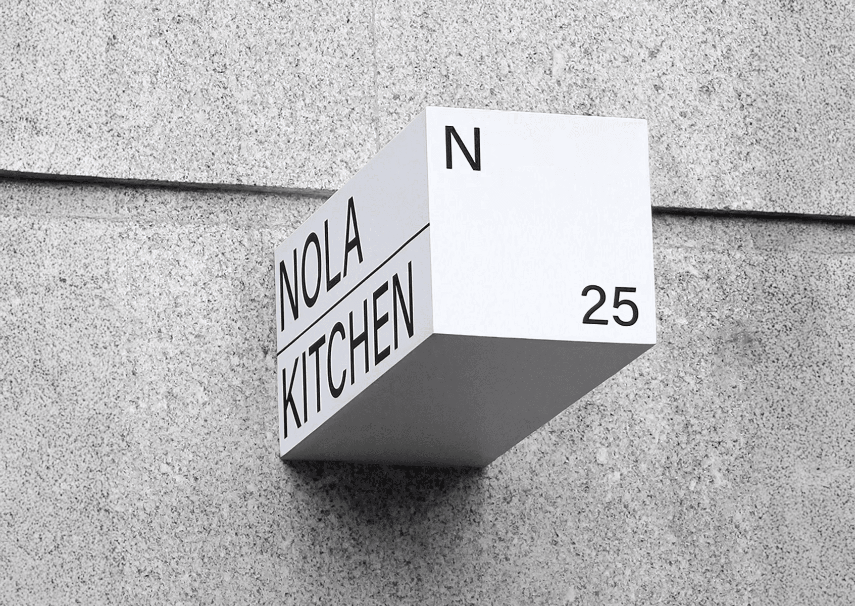
Gaveto is a serif typeface. The design is oriented in a geometric approach, characteristic of the architecture. The name Gaveto, is a term that characterizes a building with round front in the angle of two streets, this was the starting point for the project. Developed in two complementary weights Bold and Upright Italic.


Available in Bold and Upright Italic, Gaveto adapts easily to different design needs, always maintaining a strong visual impact. Its shapes combine angled serifs, clear geometric structure and a subtle vertical italic, creating a cohesive and robust typeface with architectural character. Whether you need a strong font for a headline or a readable typeface for a bold branding project, Gaveto delivers clarity, character and design flexibility. Features: Multiple weights (Bold and Upright Italic), Uppercase & lowercase letters, Numerals & punctuation


Gaveto is made for brands that want to stand out and communicate a strong, modern and confident identity. The combination of the Bold weight with the Upright Italic introduces a dynamic rhythm that attracts attention without unnecessary decoration. More than a typeface, it brings attitude a statement of character that elevates any visual identity. Ready to build with purpose? Because every structure deserves the Gaveto typeface.


Credits
Creative Direction · Bernardo BragaDesign · Bernardo BragaMotion Design · Bernardo Braga
Published
November 15, 2025